DataAnalysis/개념정리
pandas dataframe 정리2
_DAMI
2022. 4. 24. 22:48
데이터 csv파일로 저장
import pandas as pd
import matplotlib as mpl       #맷플롭립
import matplotlib.pyplot as plt

plt.rc('font', family='Malgun Gothic')

df = pd.DataFrame([[500,450,520,610],[690,700,820,900],
                   [1100,1030,1200,1380],[1500,1650,1700,1850],
                   [1990,2020,2300,2420],[1020,1600,2200,2550]],
                  index = [2015, 2016, 2017, 2018, 2019, 2020],
                  columns = ['1분기', '2분기', '3분기', '4분기'])
df.to_csv('C:/Users/user/Desktop/data2.csv', header='False',encoding='utf-8-sig')
csv 파일 읽어오기
import pandas as pd
import matplotlib.pyplot as plt
import matplotlib
data1=pd.read_csv('C:/Users/data2.csv',encoding='utf-8',index_col=0,engine='python')
data1=data1.transpose()
1. 차트 그리기
xLabel=['first','second','third','fourth']
data1.index=xLabel
data1.plot(xlabel="Quarters", ylabel="sales",title="2015~2020 Quarterly sales")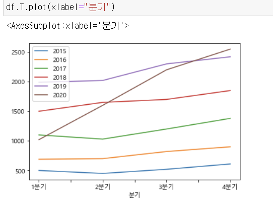


2. index name 지정

3. 조건값으로 새로운 열 만들기
def result(x):
    if x>1000:
        return "1000이상"
    else:
        return "아님"
df['결과']=df['합계'].apply(result)
df
4. 특정열들 가져오기
df1=df[['1분기','2분기']]
df1
책예제 따라해보기
import pandas as pd
red_df=pd.read_csv('winequality-red.csv',sep=';', header=0,engine='python')
white_df=pd.read_csv('winequality-white.csv',sep=';', header=0,engine='python')
1. 특정 index에 열추가
red_df.insert(0,column='type',value='red')
red_df['news']='red' #맨 마지막 열추가

2. 차트그리기
import matplotlib as mpl       #맷플롭립
import matplotlib.pylab as plt   #맷플롭립
import seaborn as sns
plt.boxplot(red_df['total sulfur dioxide'])
plt.show()
특정열, 조건값으로 차트그리기
aa= red_df[['fixed acidity','volatile acidity','citric acid']]
aa.plot(kind='hist')
bb=red_df[(red_df['fixed acidity']>4)&(red_df['volatile acidity']<30)]
3. 데이터 합치기 :테이블 합치기
wine=pd.concat([red_df,white_df])4. 데이터 값 변경
wine.columns = wine.columns.str.replace(' ','_')
wine.head()
5. group by 함수 사용
