-
[k-means]타깃마케팅을 위한 소비자군집 분석하기DataAnalysis/모델 분석 2022. 6. 2. 22:01
<개념>
1. 비지도 학습
-훈련 데이터에 타깃값이 주어지지 않은 상태에서 학습 수행
-훈련 데이터를 학습하여 모델을 생성하면서 유사한 특성을 가지는 데이터를 클러스터로 구성
-새로운 데이터의 특성을 분석하여 해당하는 클러스터를 예측
2.군집화
데이터를 클러스터(군집)로 구성하는 작업
3.군집화의 목표
서로 유사한 데이터들은 같은 그룹으로, 서로 유사하지 않은 데이터는 다른 그룹으로 분리한 것
-k개의 클러스터 수 결정
-데이터의 유사도? means 각 데이터와 클러스터 중심점 과의 평균거리
4.K-means
1)k개의 임의의 중심점 배치
2) 각 데이터들을 가장 가까운 중심점으로 할당(군집으로 형성
3)군집 내 데이터들을 기반으로 중심점 이동
4)중심점의 이동이 없을 때 까지 반복
5. K-평균 알고리즘
-k개의 중심점을 임의 위치로 잡고 중심점을 기준으로 가까이 있는 데이터를 확인한 뒤 그들과의 거리(유클리디안 거리의 제곱을 사용하여 계산)의 평균 지점으로 중심점을 이동하는 방식
-가장 많이 활용하는 군집화 알고리즘
- 클러스터의 수를 나타내는 K를 직접 지정해야함
6. 엘보 방법
-왜곡: 클러스터의 중심점과 클러스터 내의 데이터 거리 차이의 제곱값의 합
- 클러스터의 개수 K의 변화에 따른 왜곡의 변화를 그래프로 그려보면 그래프가 꺽이는 지점인 엘보 -> 그 지점의 K를 최적의 K로 선택
7. 실루엣 분석
-클러스터 내에 있는 데이터가 얼마나 조밀하게 모여있는지를 측정하는 그래프 도구
-데이터 i가 해당 클러스터 내의 데이터와 얼마나 가까운가를 나타내는 클러스터 응집력 a(i)
-가장 가까운 다른 클러스터 내의 데이터와 얼마나 떨어져있는가를 나타내는 클러스터 분리도 b(i)를 이용
-실루엣 계수 S(i) = b(i)-a(i) / max(a(i),b(i))
- -1~1 사이의 값을 가지며 1에 가까울수록 좋은 군집화 : 1에 가까우면 다른 군집과 떨어져있음, -1에 가까우면 다른 군집에 샘플이 할당되어 있음
-군집이 잘 되었는지 성능 평가 기준이 모호함
-각 군집 간의 거리가 얼마나 효율적으로 분리되었는가? 실루엣 계수로 판단
-다른 군집과의 거리는 떨어져 있고, 동일 군집끼리의 데이터는 서로 가깝게 뭉쳐 있는 척도/지표
<프로젝트>
-목표: k-평균으로 온라인 판매 데이터를 분석한 수 타깃 마케팅을 위한 소비자 군집을 만드는 프로젝트
-타깃 마케팅: 구매 행동을 가진 그룹을 세분화하여 각 특성에 맞는 마케팅을 하는 전략
-타깃 마케팅에서 고객 정보를 분석하고 그룹을 세분화하는 작업에 군집 분석 사용
-사전 데이터 : Online Retail Data Set -UCI Machine Learning Repository 검색 -> Data Folder 클릭 -> Online Retail.xlsx
■ 데이터 준비 및 탐색
import pandas as pd
retail_df= pd.read_excel('./Online_Retail.xlsx')
retail_df.head()
#오류데이터정제 retail_df= retail_df[retail_df['Quantity']>0] retail_df= retail_df[retail_df['UnitPrice']>0] retail_df= retail_df[retail_df['CustomerID'].notnull()] #'CustomerID' 자료형을정수형으로변환 retail_df['CustomerID'] = retail_df['CustomerID'].astype(int) #중복레코드제거 retail_df.drop_duplicates(inplace= True) print(retail_df.shape) #작업확인용출력pd.DataFrame([{'Product':len(retail_df['StockCode'].value_counts()), 'Transaction':len(retail_df['InvoiceNo'].value_counts()), 'Customer':len(retail_df['CustomerID']. value_counts())}], columns = ['Product', 'Transaction', 'Customer'], index = ['counts']) retail_df['Country'].value_counts()#주문금액컬럼추가 retail_df['SaleAmount'] = retail_df['UnitPrice']*retail_df['Quantity'] retail_df.head() #작업확인용출력aggregations = { 'InvoiceNo':'count', 'SaleAmount':'sum', 'InvoiceDate':'max' } customer_df= retail_df.groupby('CustomerID').agg(aggregations) #customer_df = retail_df.sort_values('SaleAmount').groupby('CustomerID').agg(aggregations) customer_df= customer_df.reset_index() #groupby에자동으로지정한컬럼으로인덱스가변함에따른인덱스초기화 customer_df.head() #작업확인용출력
customer_df= customer_df.rename(columns = {'InvoiceNo':'Freq', 'InvoiceDate':'ElapsedDays'})
customer_df.head() #작업확인용출력

import datetime
customer_df['ElapsedDays'] = datetime.datetime(2011,12,10) -customer_df['ElapsedDays']
customer_df.head() #작업확인용출력

customer_df['ElapsedDays'] = customer_df['ElapsedDays'].apply(lambda x: x.days+1)
customer_df.head() #작업확인용출력
import matplotlib.pyplot as plt
import seaborn as sns
fig, ax = plt.subplots()
ax.boxplot([customer_df['Freq'], customer_df['SaleAmount'], customer_df['ElapsedDays']], sym= 'bo')
plt.xticks([1, 2, 3], ['Freq', 'SaleAmount','ElapsedDays'])
plt.show()
파란색 점sym='bo' 아웃레이어 값이 많은 것은 데이터 값이 고르게 분포 x 치우쳐 있다.
로그 함수를 적용하여 값의 분포를 고르게 조정
import numpy as np
customer_df['Freq_log'] = np.log1p(customer_df['Freq'])
customer_df['SaleAmount_log'] = np.log1p(customer_df['SaleAmount'])
customer_df['ElapsedDays_log'] = np.log1p(customer_df['ElapsedDays'])
customer_df.head() #작업확인용출력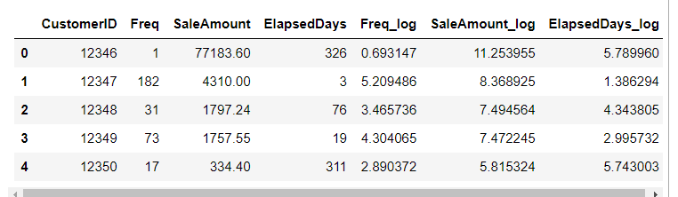
fig, ax = plt.subplots()
ax.boxplot([customer_df['Freq_log'], customer_df['SaleAmount_log'], customer_df['ElapsedDays_log']], sym= 'bo')
plt.xticks([1, 2, 3], ['Freq_log', 'SaleAmount_log', 'ElapsedDays_log'])
plt.show()
아웃레이어가 줄어들고 모양도 균형을 잡힘
■ 분석 모델 구축
X_features 를 정규 분포로 스케일링
from sklearn.cluster import KMeans
from sklearn.metrics import silhouette_score, silhouette_samples
X_features= customer_df[['Freq_log', 'SaleAmount_log', 'ElapsedDays_log']].values
from sklearn.preprocessing import StandardScaler
X_features_scaled= StandardScaler().fit_transform(X_features) #정규분포로 스케일링 한다.
엘보 방법으로 클러스터 개수 k선택하기
distortions = []
for i in range(1, 11):
    kmeans_i= KMeans(n_clusters= i, random_state= 0) #모델생성
    kmeans_i.fit(X_features_scaled) #모델훈련
    distortions.append(kmeans_i.inertia_)
#cluster에속한samples가얼마나가깝게모여있는지나타내는값(거리의제곱)
plt.plot(range(1,11), distortions, marker = 'o')
plt.xlabel('Number of clusters')
plt.ylabel('Distortion')
plt.show()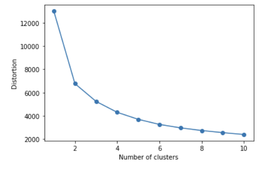
클러스터 개수에 따른 왜곡 값 inertia_ 변화 그래프 엘보는 3, 클러스터 개수를 3을하고 모델 구축
kmeans= KMeans(n_clusters=3, random_state=0) #모델생성
#모델학습과결과예측(클러스터레이블생성)
Y_labels= kmeans.fit_predict(X_features_scaled)
customer_df['ClusterLabel'] = Y_labels
customer_df.head()
■ 결과 분석 및 시각화
1)각 클러스터의 비중을 가로 바 차트로 시각화
from matplotlib import cm
def silhouetteViz(n_cluster, X_features):
    kmeans= KMeans(n_clusters= n_cluster, random_state= 0)
    Y_labels= kmeans.fit_predict(X_features)

    silhouette_values= silhouette_samples(X_features, Y_labels, metric = 'euclidean')

    y_ax_lower, y_ax_upper= 0, 0
    y_ticks= []

    for c in range(n_cluster):
        c_silhouettes= silhouette_values[Y_labels== c]
        c_silhouettes.sort()
        y_ax_upper+= len(c_silhouettes)
        color = cm.jet(float(c) / n_cluster)
        plt.barh(range(y_ax_lower, y_ax_upper), c_silhouettes, height = 1.0, edgecolor= 'none', color = color)
        y_ticks.append((y_ax_lower+ y_ax_upper) / 2.)
        y_ax_lower+= len(c_silhouettes)

    silhouette_avg= np.mean(silhouette_values)
    plt.axvline(silhouette_avg, color = 'red', linestyle= '--')
    plt.title('Number of Cluster : '+ str(n_cluster) + '\n' + 'Silhouette Score : '+ str(round(silhouette_avg,3)))
    plt.yticks(y_ticks, range(n_cluster))
    plt.xticks([0, 0.2, 0.4, 0.6, 0.8, 1])
    plt.ylabel('Cluster')
    plt.xlabel('Silhouette coefficient')
    plt.tight_layout()
    plt.show()
                                          #코드분석하지 않았음
2)클러스터의 데이터 분포를 확인하기 위해 스캐터 차트로 시각화
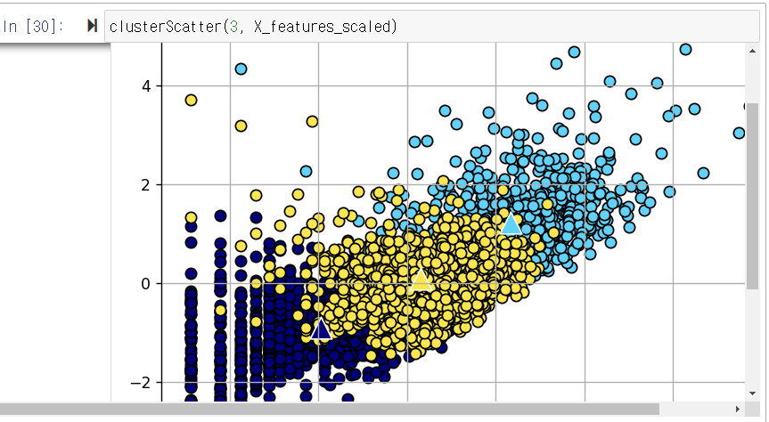
def clusterScatter(n_cluster, X_features):
    c_colors= []
    kmeans= KMeans(n_clusters= n_cluster, random_state= 0)
    Y_labels= kmeans.fit_predict(X_features)

    for i in range(n_cluster):
        c_color= cm.jet(float(i) / n_cluster) #클러스터의색상설정
        c_colors.append(c_color)
        #클러스터의데이터분포를동그라미로시각화
        plt.scatter(X_features[Y_labels== i,0], X_features[Y_labels== i,1], marker = 'o', color = c_color, edgecolor= 'black', s = 50, label = 'cluster '+ str(i))
        #각클러스터의중심점을삼각형으로표시

    for i in range(n_cluster):
        plt.scatter(kmeans.cluster_centers_[i,0], kmeans.cluster_centers_[i,1], marker = '^', color = c_colors[i],edgecolor= 'w', s = 200)
        plt.legend()
        plt.grid()
        plt.tight_layout()
    plt.show()
3) 3d scatter plot
%matplotlib notebook
# 주피터노트북사용시matplotlib backend 활성화
from mpl_toolkits.mplot3d import Axes3D

def clusterScatter_3D(n_cluster, X_features):
    c_colors= []
    kmeans= KMeans(n_clusters= n_cluster, random_state= 0)
    Y_labels= kmeans.fit_predict(X_features)

    plt.figure(figsize=(3, 3))
    ax = plt.axes(projection='3d')

    for i in range(n_cluster):
        c_color= cm.jet(float(i) / n_cluster) #클러스터의색상설정
        c_colors.append(c_color)
    #클러스터의데이터분포를동그라미로시각화
        ax.scatter(X_features[Y_labels== i,0], X_features[Y_labels== i,1], X_features[Y_labels== i,2], label = str(i))
        #각클러스터의중심점을삼각형으로표시
    for i in range(n_cluster):
        ax.scatter(kmeans.cluster_centers_[i,0], kmeans.cluster_centers_[i,1], kmeans.cluster_centers_[i,2])
        ax.legend()
        ax.grid()
        #ax.tight_layout()
    ax.set_xlabel('Freq_log')
    ax.set_ylabel('SaleAmount_log')
    ax.set_zlabel('ElapsedDays_log')

    plt.show()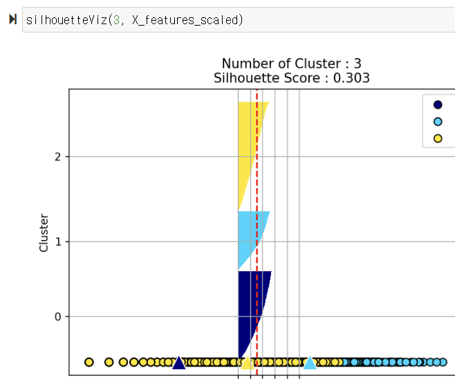
클러스터의 데이터 분포(원으로 표시)와 클러스터의 중심점 위치(삼각형으로 표시)

군집화가 잘된 클러스터 4개를 이용하여 모델생성
best_cluster= 4
kmeans= KMeans(n_clusters= best_cluster, random_state= 0)
Y_labels= kmeans.fit_predict(X_features_scaled)
customer_df['ClusterLabel'] = Y_labels
customer_df.head()
clusterLabel을 기준으로 그룹을 만든다
customer_df.groupby('ClusterLabel')['CustomerID'].count()customer_cluster_df= customer_df.drop(['Freq_log', 'SaleAmount_log', 'ElapsedDays_log'],axis = 1, inplace= False) #주문1회당평균구매금액: SaleAmountAvg customer_cluster_df['SaleAmountAvg'] = customer_cluster_df['SaleAmount']/customer_cluster_df['Freq'] customer_cluster_df.head()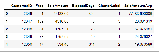
customer_cluster_df.drop(['CustomerID'],axis = 1, inplace= False).groupby('ClusterLabel').mean()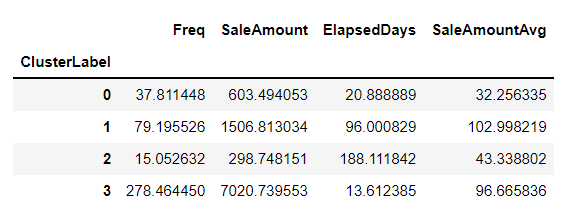
출처: 데이터 과학 기반의 파이썬 빅데이터 분석(이지은 지음)책을 공부하며 작성한 내용입니다.
'DataAnalysis > 모델 분석' 카테고리의 다른 글
[결정 트리 분석] 센서 데이터로 움직임 분류하기 (0) 2022.06.02 [로지스틱 회귀 분석] 특징데이터로 유방암 진단하기 (0) 2022.06.01 [선형 회귀] 자동차 예상 연비 예측하기 (0) 2022.06.01 [선형회귀분석+ 산점도/선형회귀그래프] 환경에따른주택가격예측하기 (0) 2022.06.01 [상관분석+히트맵] 타이타닉호 생존율 분석하기 (0) 2022.06.01